Long-time Baen Books designer Carol Russo delivers the goods on Baen covers, Baen history, and recollections of Jim Baen himself in an illuminating interview.
What did you study in college?
I graduated from The School of Visual Arts, in New York City. My major was in illustration. At the time my dream was to be a famous childrens book illustrator. A goal I would have loved to pursue, but like most graduates, I needed a paying job. Becoming a full time illustrator was not to be although I always thought some day, in the future, I would pick up where I left off.
My first job after graduating was in publishing, at a company called William Morrow. It was here I first learned book and cover design. It was a small art department that consisted of myself and the art director. I learned everything about designing books from the interior, to the cover, often creating the art or graphics. I learned a tremendous amount about production. I would even go on press to approve the covers. Working here made me realize that I enjoyed being a graphic designer. I began to view type designing as an art. I learned how to hand letter and create my own fonts.
The categories of books published at William Morrow consisted of romances, mysteries, fiction, non-fiction and travel. I can not remember very many, if any, science fiction books.
I spent about two years at William Morrow
How did you start working for science fiction publishers?
My second job in publishing was as a cover designer for Ace Books. At the time, a man named Tom Doherty was the publisher and a man they called Jim Baen was the head of their science fiction division. Since I always loved science fiction I would spend a great deal of my time designing Jim’s books. Jim and I really clicked and it wasn’t long before he asked the art director, Charles Volpe, to allow me to design all his science fiction books. Charles was reluctant, but as usual, Jim got his way. I became known as Jim Baen’s designer. That worked for me. I found my niche in science fiction.
A few years later, Tom Doherty and Jim left Ace Books together and began Tom Doherty and Associates, with a division called “Jim Baen Presents.”
I also left Ace Books and began to freelance. I hooked up with Tom and Jim and began to design most of their books.
Their company grew and split into TOR and Baen Books. I followed and designed for both.
TOR eventually merged with Macmillan with Tom as the publisher and Jim stayed as Baen Books. Eventually Jim moved the company to Riverdale NY, which was only fifteen minutes away from where I lived.
I continued to work with both Tom and Jim.
Are you a science fiction/fantasy fan yourself?
I have always loved science fiction, fantasy and yes, even horror. I cannot remember a time in my life that I was not fascinated by it. I am guilty of following all formats: television, movies, books, fairs and conventions.
I still remember the first science fiction movie I watched on television as a small child. It was called Them. I had nightmares for weeks after, but I was hooked. I followed Star Trek, Star Wars. I am addicted to the SyFy channel and drag my husband to every sci fi movie, good or bad, that comes to the theater.
As for books, I personally think Baen publishes the best. But of course I am a little prejudiced.
Yes, I am a fan.
Do you remember the first cover you designed or the first book you typeset?
My first cover design was a nonfiction book titled When the Fire Reaches Us. I had just begun working at William Morrow and knew nothing about book design.
I created the art, which was a black and white drawing, designed the cover, ruled up my first mechanical and designed my first interior. I learned a lot working on that book. I came to respect the process that one needed to go through in order to create the traditional “book.”
What industry changes have you seen since you started working?
When I started designing covers we did not use computers. Publishing was still in the dark ages. We used traditional methods, drawing boards, T-squares and triangles, rubber-cement, rulers and Rapidograph pens. Mechanicals were ruled up by hand. Black and white photo prints of the art were cemented on the mechanical board and overlays of acetate with the titles (black and white stats) were placed in position. All were marked FPO which meant, For Position Only. We needed to mark the tissue with specific instructions. The color for titles, authors, back covers etc. They needed to be broken down into process color. For example, if the type were to be red, it would be marked to print 100% magenta and 100% yellow. We use a chart to decide combinations of the four colors to create all the colors used on a cover.
Remember, everything was in black and white. So if the printer did not read your directions correctly or if you marked something wrong, it would affect the final cover. If you used a PMS color rather than the four color process colors it would add to the cost of the cover. Four color process consisted of PMS cyan, magenta, yellow and black.
I designed and hand lettered most of my titles with a pen on vellum, and all cover text was set at a printer. All elements were eventually combined on a mechanical board and marked up.
This marked up mechanical was sent to a printer with a color transparency of the art, to replace the black and white photoprint. The printer would than prepare the cover for press.
When we designed the interior of a book we would actually count the characters of the manuscript manually. Then design a master tissue design for the printer to follow. We used traditional math to figure the final page count.
Today, we prepare everything on the computer. We still use four color process but we now control color within our files. Our files are our mechanical. Most printers now work with high resolution pdfs, which we supply. So what we send to the printer is what he will print. There are no more surprises.
I still create my titles as if they were hand lettered but now it is drawn on the computer in Illustrator or Photoshop. In these programs after creating the titles you can add color and special effects.
The interior is set and designed in a program that is later saved as a Postscript file and distilled into a high-resolution pdf.
We design the chapter headings, title pages and flow the text into the document. There is no need to count characters. The designer is the one responsible for bad breaks and sends a first pass to be copy edited. Then the designer inputs the corrections for a final pass. It is then sent to the printer.
Is it easier now that so much work can be done digitally, or do you prefer the days of transparencies?
Like everything in life when something is gained, something is lost. Today I actually hand letter on the computer. There is no longer a need for a drawing board, T-square or triangle or Rapidograph pen, and although I miss the hands-on traditional methods, I find that I am in total control of the final project. The printer no longer needs to interpret what I want. He can see it.
I often think it may be harder for new designers to develop an eye for the things we learned traditionally. We were forced to understand the “why and how.”
When you get in a piece of cover art, how do you decide on fonts, colors, word placement? What goes into designing a good cover?
When I receive a piece of art I begin with creating comps. Each comp is generally designed with the title in different type styles and colors. I then send these comps as jpegs to an art director or publisher for approval or changes.
The title type should always complement the art not fight it. Hard sci fi, fantasy, military and nonfiction all have a very specific look or feeling. For example, I would not want to design a military sci fi with romance type or a fantasy with hard block type. It needs to reflect the subject and content.
I try to think of the final cover as art. The type should stand on its own as should the art. Together they should create a painting.
Do you have a favorite cover that you've done? What makes this particular one stand out for you?
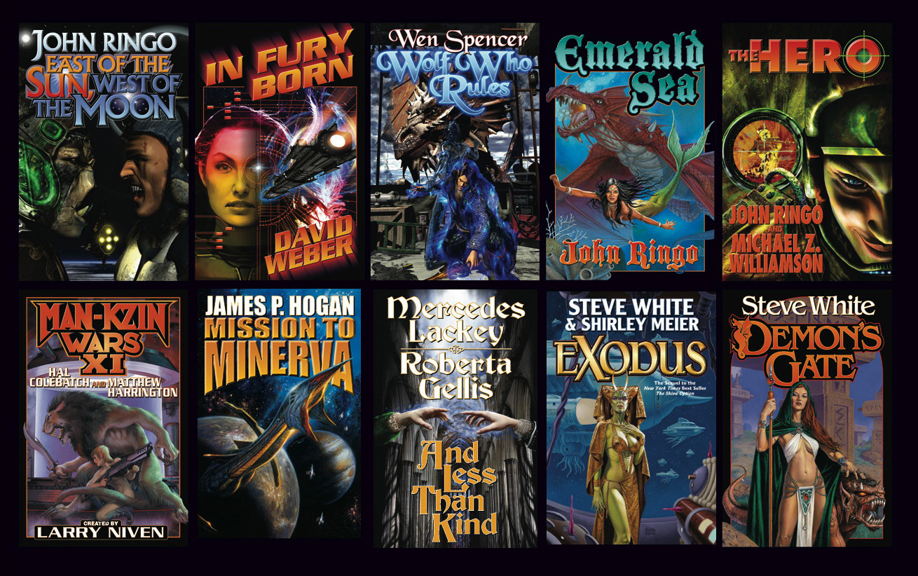
There have been so many. Some of the first I did on the computer stay with me because I suffered through re-learning everything I had originally done by hand. I will attach a few of my first all-computer covers.
What was the first book you did for Jim Baen? How did you start working with him? This was before Baen Books was a gleam in his eye, wasn't it?
I cannot remember the very first book I worked on for Jim but it would have been one published by Ace Books. It was at Ace I met Jim and started to work with him. From the start I knew he was one of the best in the science fiction publishing world. He was a master at getting his authors, artists and designers to produce their best work.
Jim liked to control. That meant no one or company was going to determine for him what was best for his books. So it did not surprise me that Jim left Ace to create his own domain.
What are some of your favorite memories of working with Jim?
It seemed liked I knew Jim forever. I met him at my second job in publishing at Ace Books. At first I was intimidated by him -or rather, by his reputation. People at Ace thought he was difficult to work with. When I first met him I really did not know what to expect. But I liked Jim and Jim liked the way I designed his books. He also was aware I loved science fiction. We got along just fine. In fact, I it wasn’t long before he had me designing all his books.
One of my favorite memories was one that happened shortly after Jim and Tom left Ace.
One day Tom pulled me aside and asked me to talk to Jim about his “Jim Baen Presents” series. It seemed Jim kept making his “Jim Baen Presents” logo larger and larger. So large, in fact that it began to overpower the authors’ names. Tom wanted me to get Jim to reduce the size but Tom did not want to be the one to approach Jim. He felt I stood a better chance of getting Jim to agree.
I went into Jim, we talked and he reduced the “Jim Baen Presents” to a respectable size. Jim was tough, but was always willing to listen to a reasonable argument. He was not always willing to do what you recommended, but he would listen.
I remember when I first decided to go freelance I could not find work space. There wasn't a building in Manhattan that would allow me to sign a lease. I was not established and could not prove a steady income. So Jim co-signed for my first office. If it wasn’t for him I may not have been able to stay in the city as a freelancer. I owed Jim.
Science fiction lost an icon, and he will be forever missed.